In designing Copenhagen Central Station, Chief Architect of the DSB Heinrich Wenck wanted to create a station "suitable for Denmark–for our country's situation and its character–so that the last impression that departing Danes got was the same as that which met the arriving foreigners: something Danish”, and he wanted to ensure that “people who are going to travel shall not meet people who are returning”. In this interior perspective of the departures area, we see how he accomplished both–the use of red brick, sandstone, and timber, the local materials that defined the National Romantic style, expresses Danishness, and the small wooden kiosks on the right formed part of an impassable luggage island that separated arrivals from departures.

What’s changed? Fewer hats, fewer clocks, less wood, a new floor, more flags, surveillance cameras…turns out a lot of little things change in a century of rail travel. The absence of those steampunk chandeliers stands out–where twelve originally decorated the station, there are now only two (and two others were moved to Østerport).
Most substantively, Hovedbanegård is no longer split in two, and passengers can roam freely regardless of whether they’re coming or going. In response to the opening of the suburban S-tog in 1934, DSB punched a passage through the baggage island, which allowed travelers to cross to the other side of the hall. Then, a 1980s reconstruction of the station ultimately obliterated all separation between arrivals and departures–with passengers traveling much lighter, there was no longer any need for an enormous luggage forwarding area.
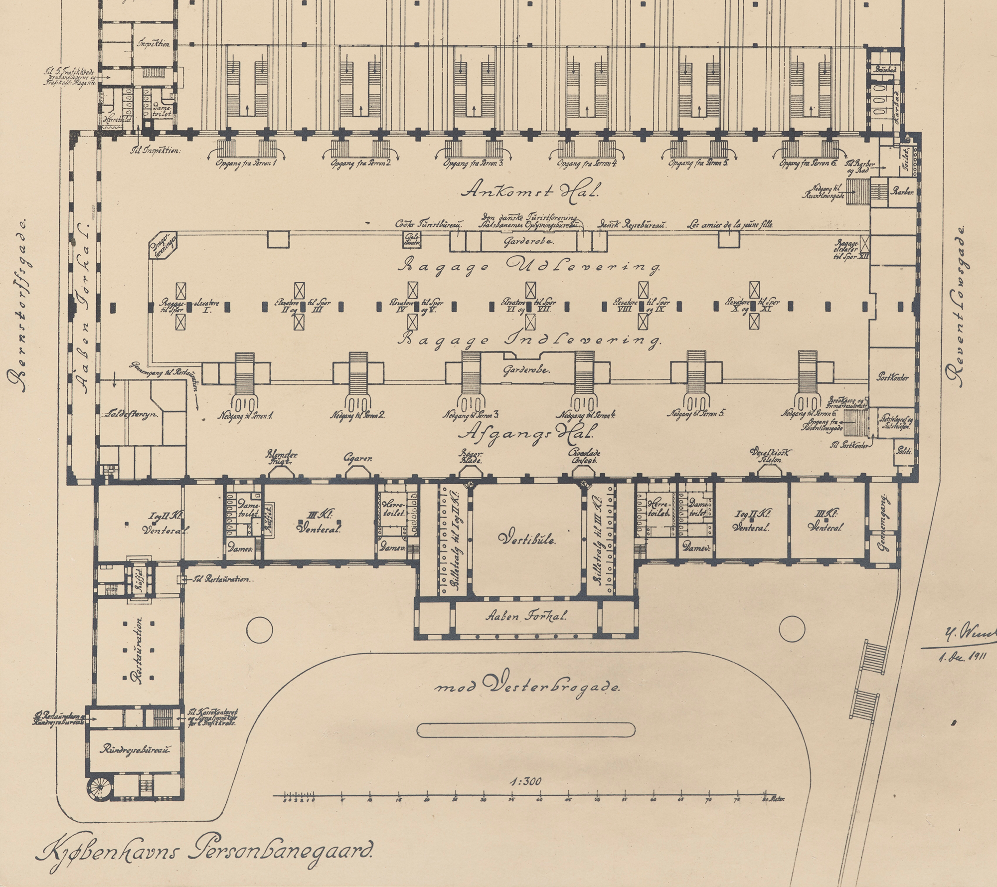
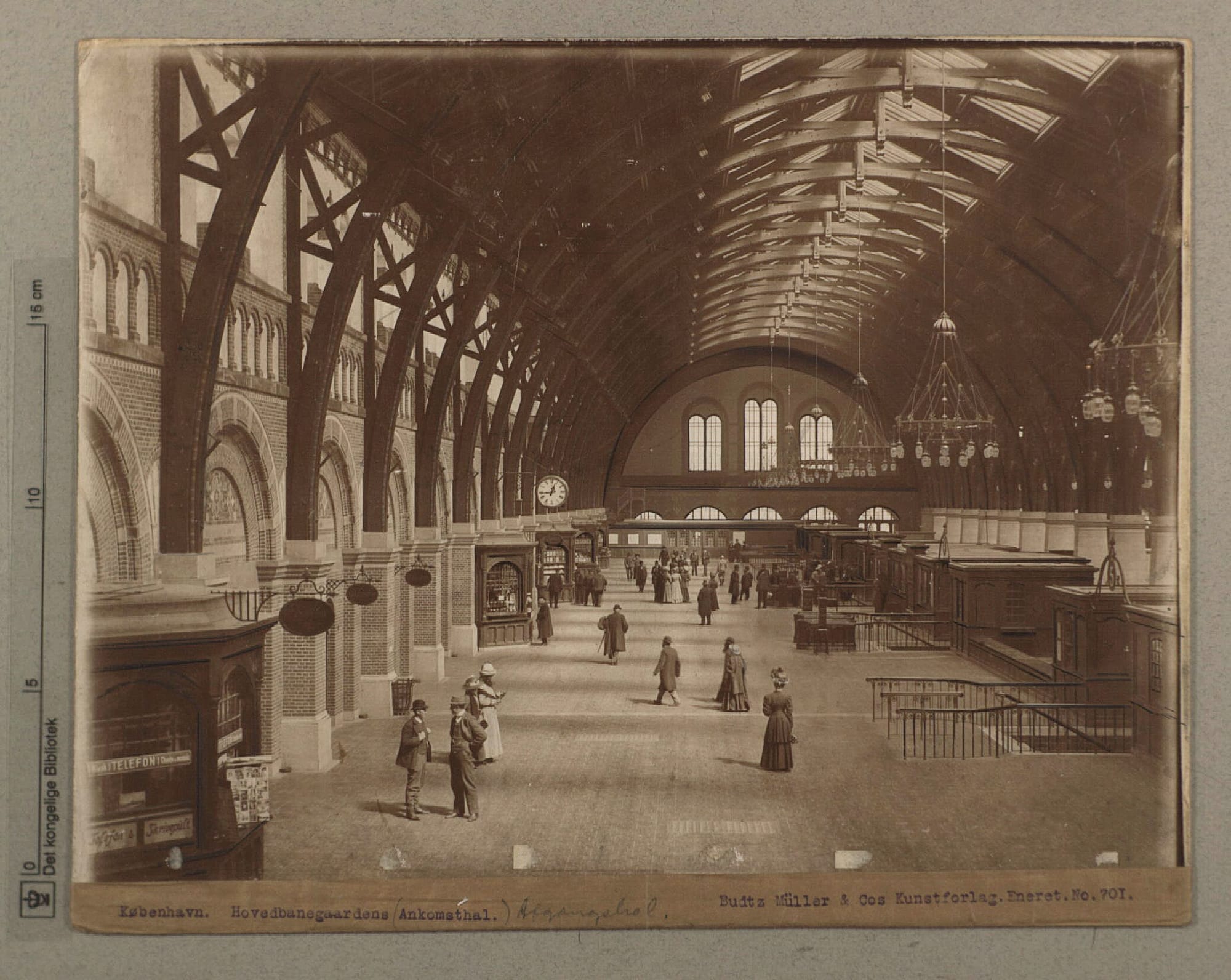
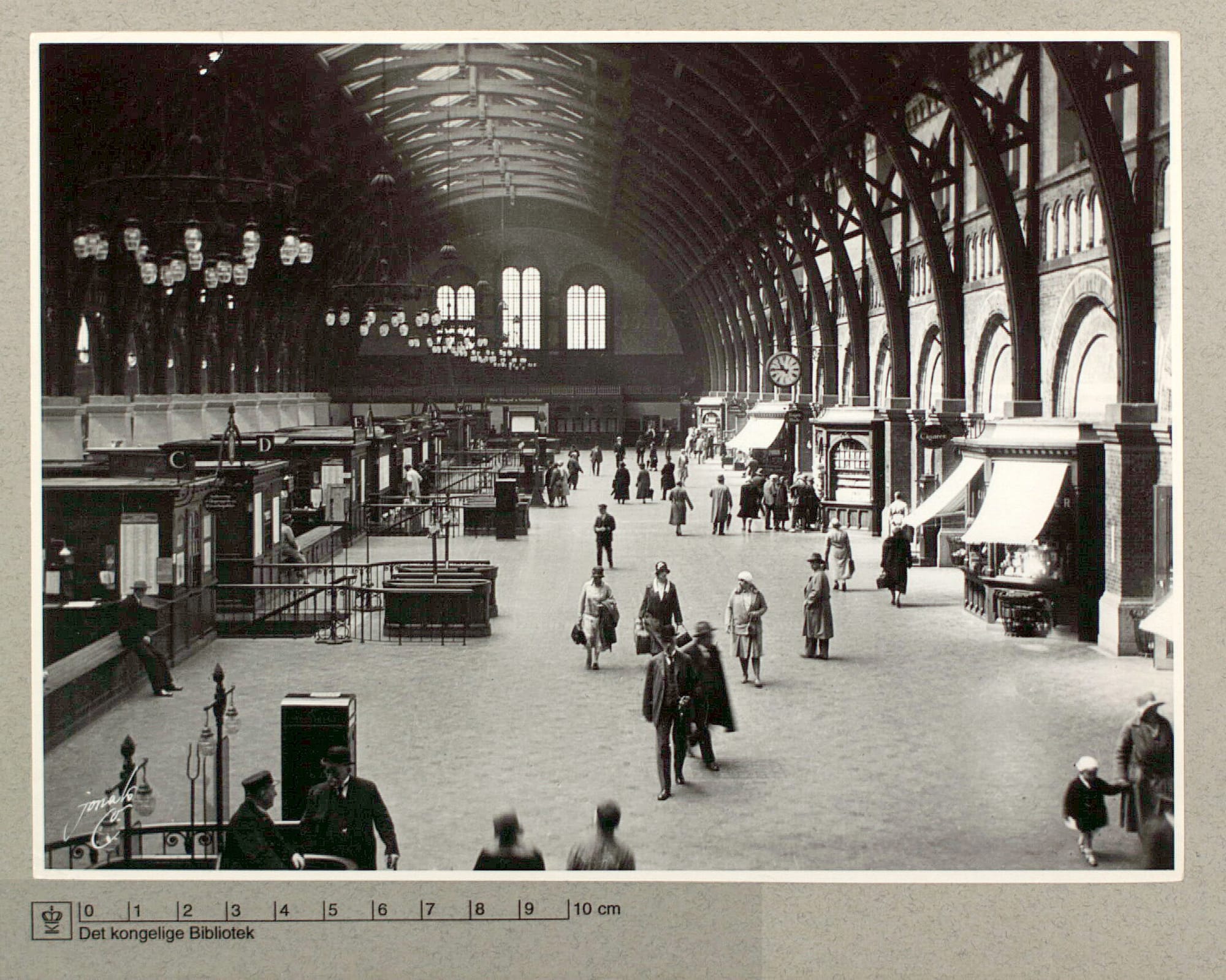
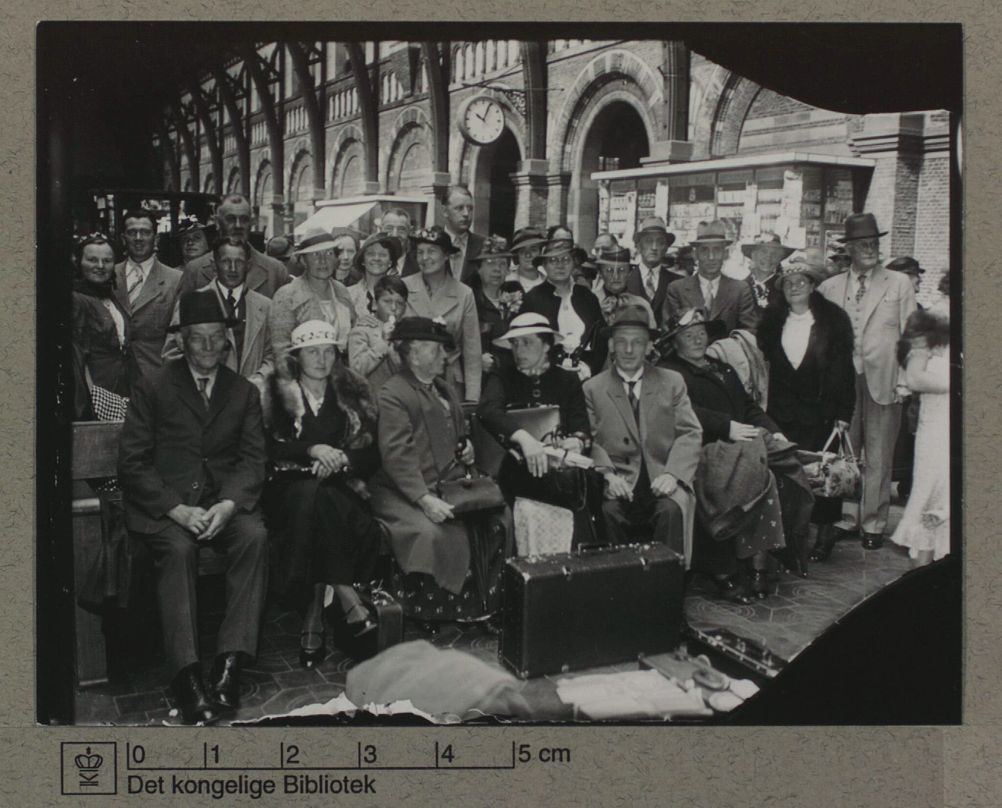
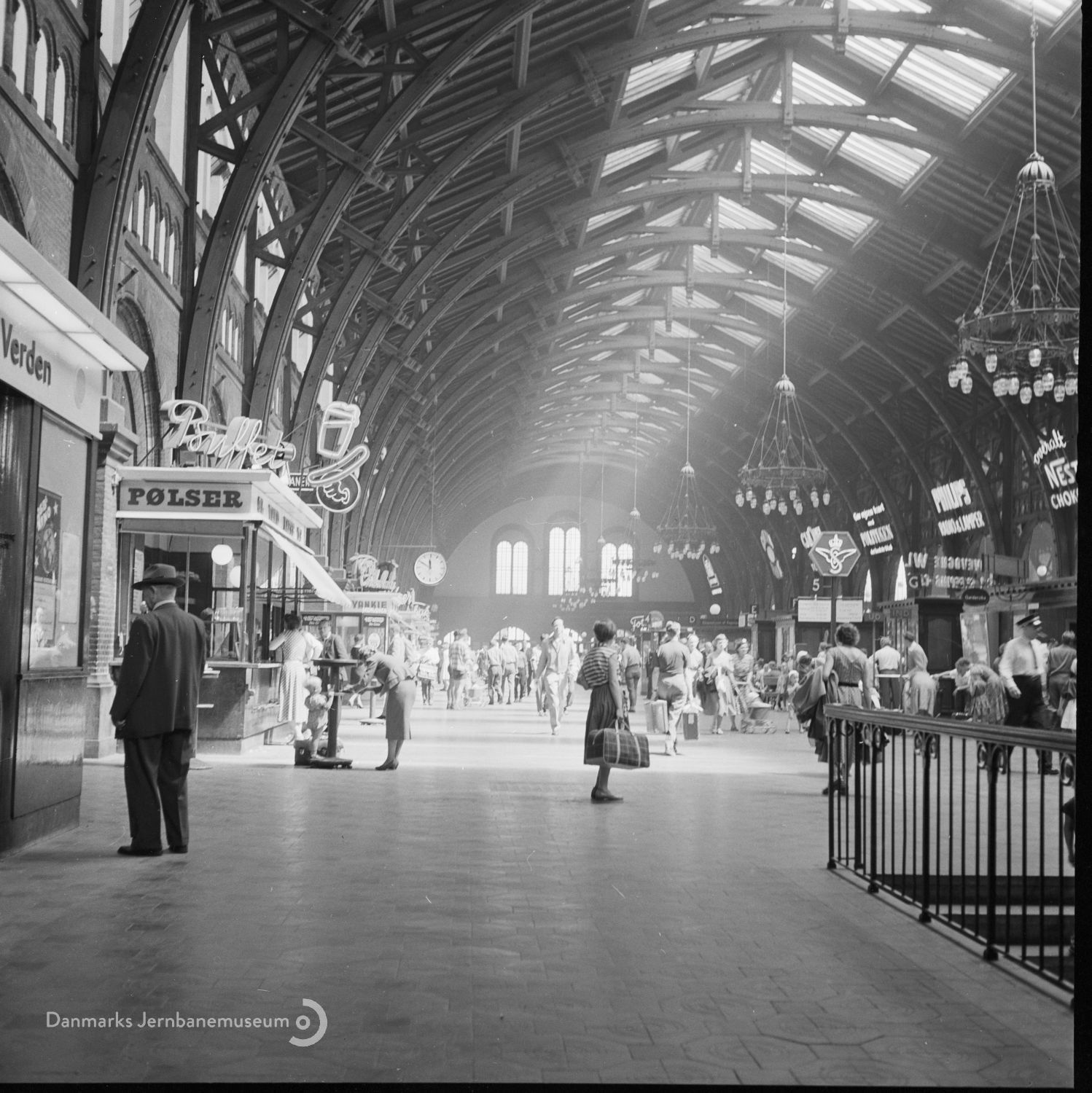
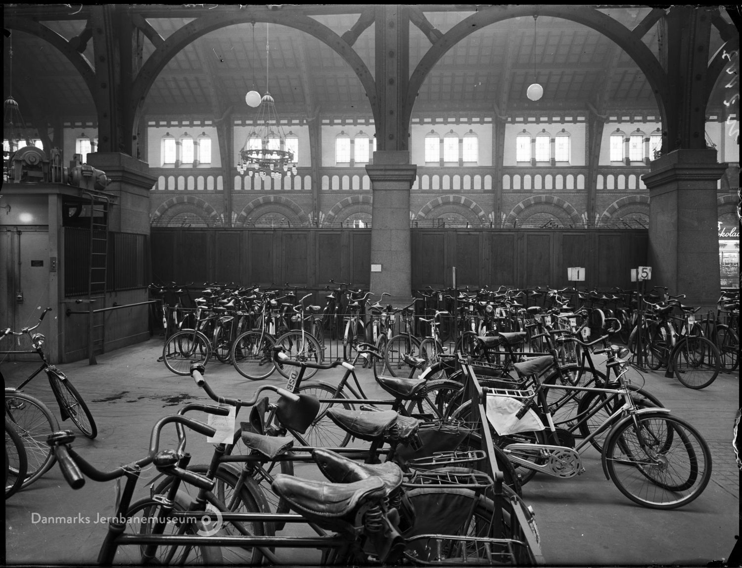
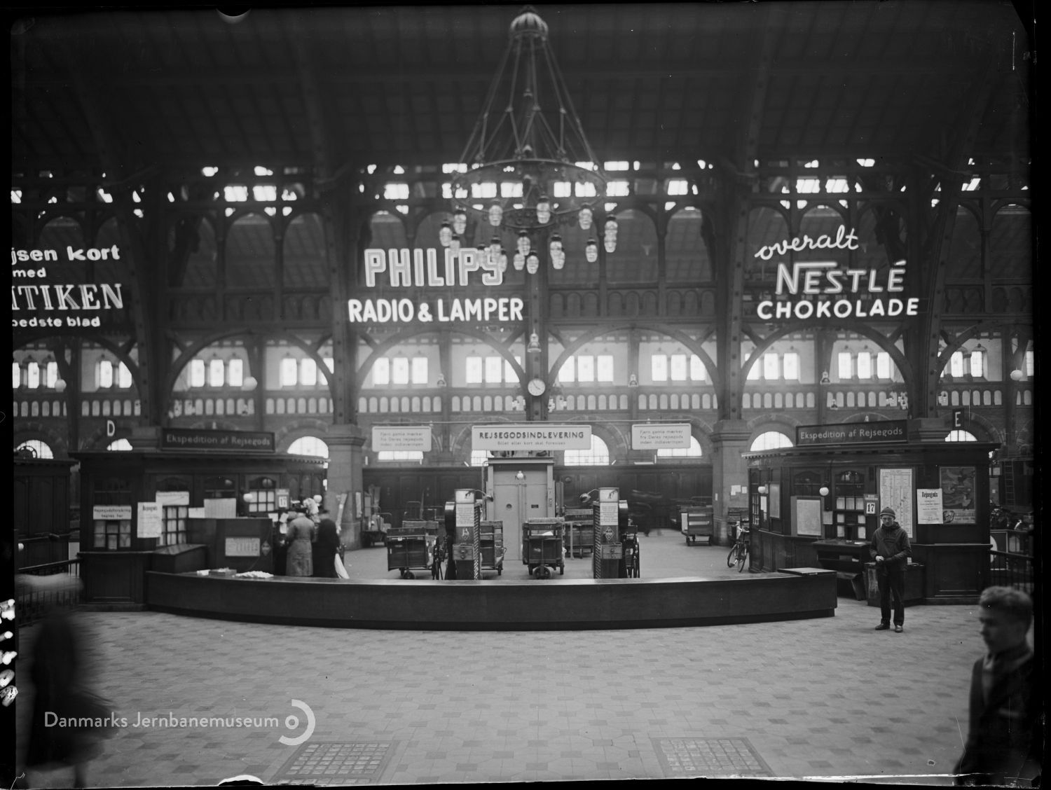
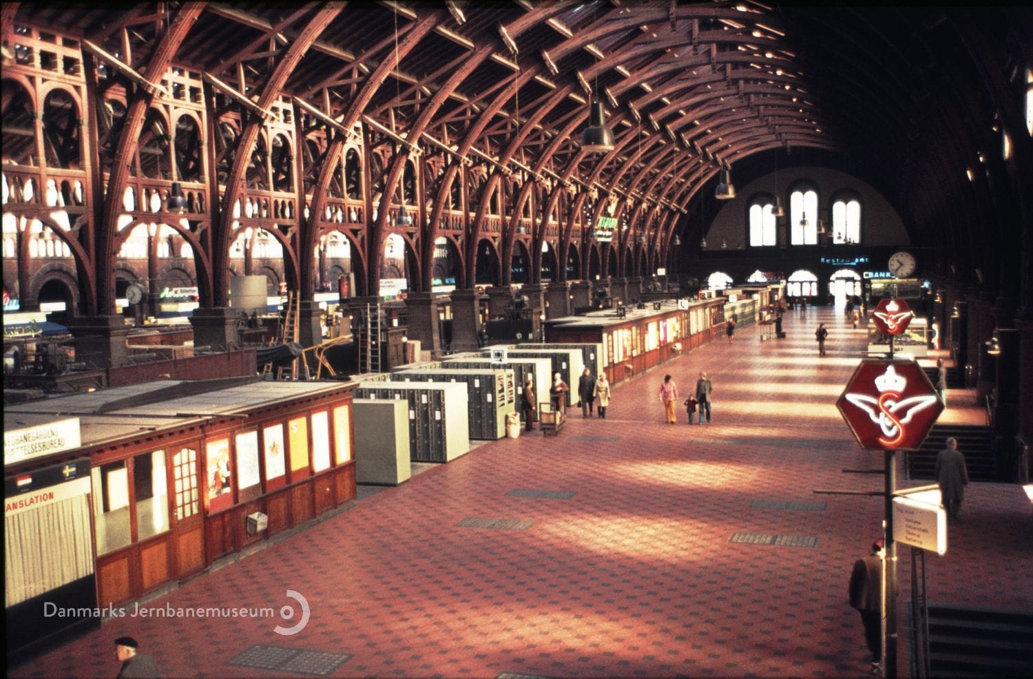
Floor plan of the new Copenhagen Central Station (see how it's separated into an Ankomst Hal and Afgangs Hal?), Det Kgl. Bibliotek | Departure hall, undated, Det Kgl. Bibliotek | Arrivals hall, undated, Det Kgl. Bibliotek | Travelers with a suitcase, Holger Damgaard, Det Kgl. Bibliotek | Travelers with a child, Holger Damgaard, Det Kgl. Bibliotek | Departures area, 1956, Danmarks Jernbanemuseum | Checked bikes, 1953, Danmarks Jernbanemuseum | Baggage check from the departures hall, 1959, Danmarks Jernbanemuseum | Arrivals, 1974, Kurt Jeppesen, Danmarks Jernbanemuseum
Functionally, Heinrich Wenck modeled Hovedbanegård on Hamburg’s Central Station, but stylistically it’s a quintessentially Danish example of National Romantic architecture. Popular at the turn of the century, the National Romantic style was an outgrowth of the search for an “original” national architecture for the emerging nation-states of Northern Europe. In Denmark, that manifested in a style that asked, “what if the Vikings did the Italian Renaissance?”.
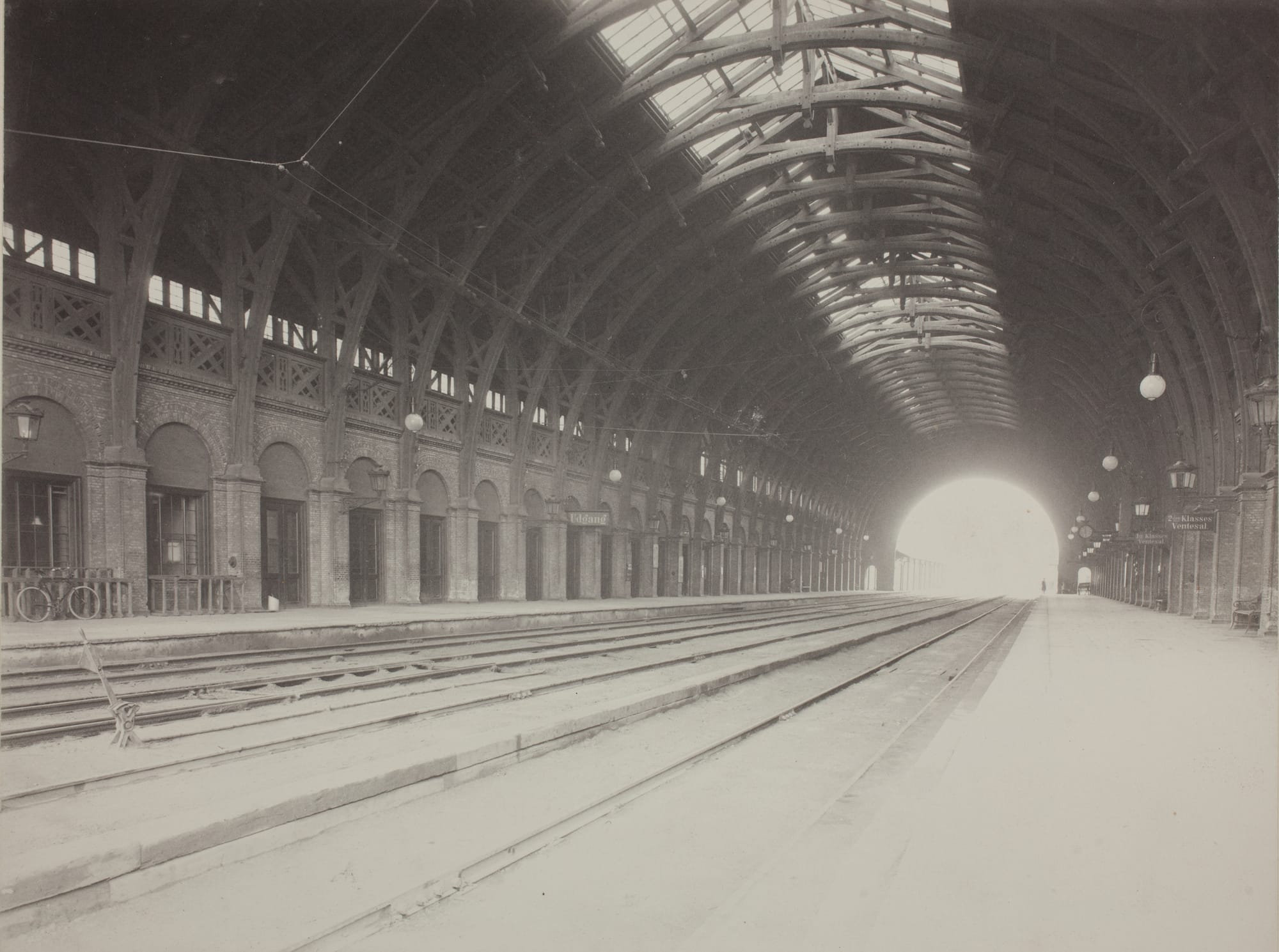
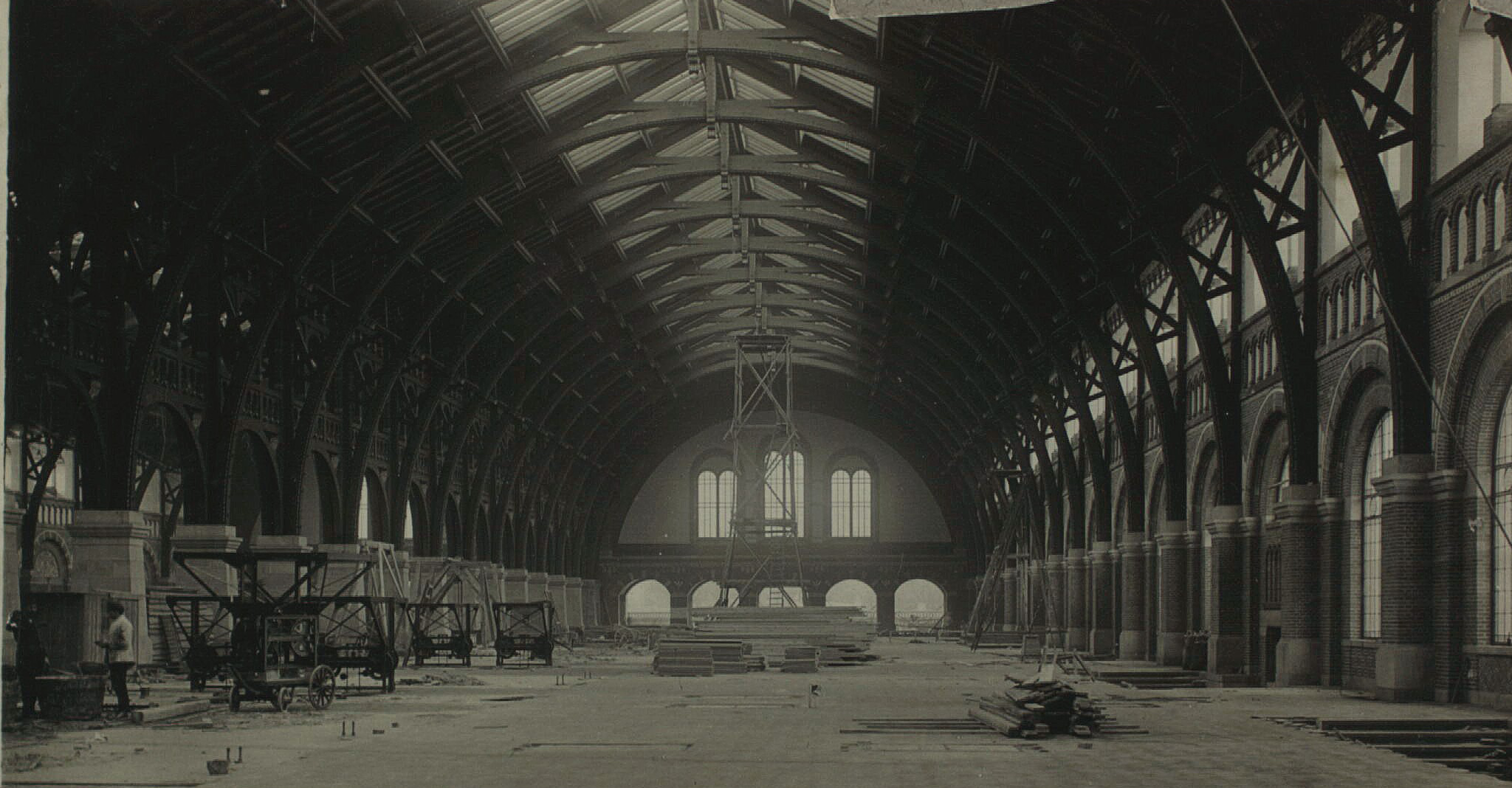
Train hall of the 2nd Copenhagen Central Station, 1911, Frederik Riise, Museum of Copenhagen | 3rd central station under construction, Det Kgl. Bibliotek
The interior is also a National Romantic nod to the station’s predecessor, the second Copenhagen Central Station (yeah, this is the third; rail travel had already been big for half a century by the time this version of Hovedbanegård opened in 1911). Designed by Johan Daniel Herholdt and located roughly where the SAS Royal Hotel stands today, the second station was defined by an enormous wooden arch that covered the entire train hall–the wooden arches of Hovedbanegård the III seems like an intentional reference to its forebear.
Copenhagen Central is also famously a gesamtkunstwerk, with architect Heinrich Wenck involved in designing every aspect of the building. That encompassed the big, sweeping stuff–the main concourse and the train shed–to the mundane–the benches, the tile, even the door handles. That also means that Wenck designed those awesome chandeliers–I wonder where the other eight went?
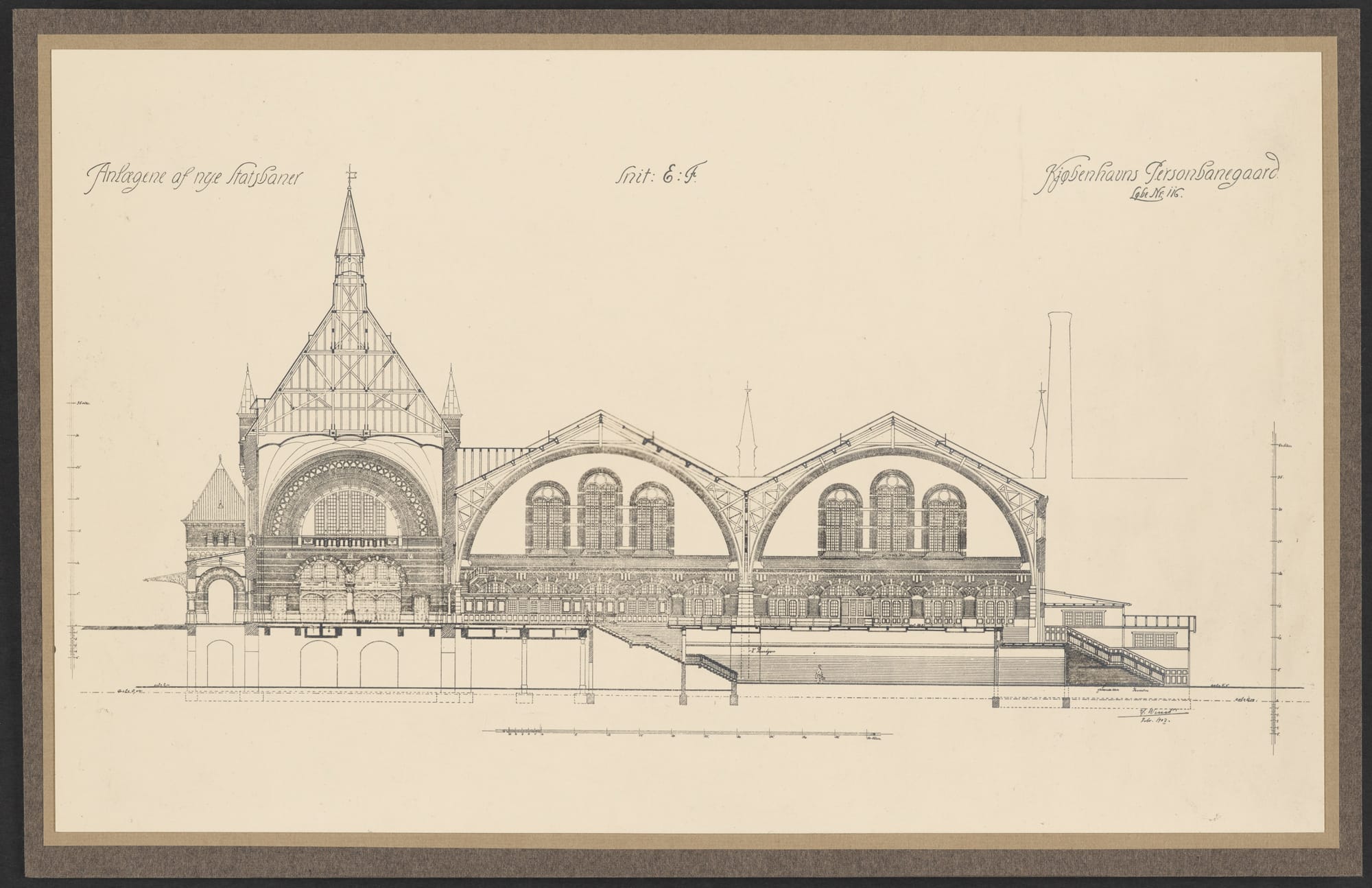
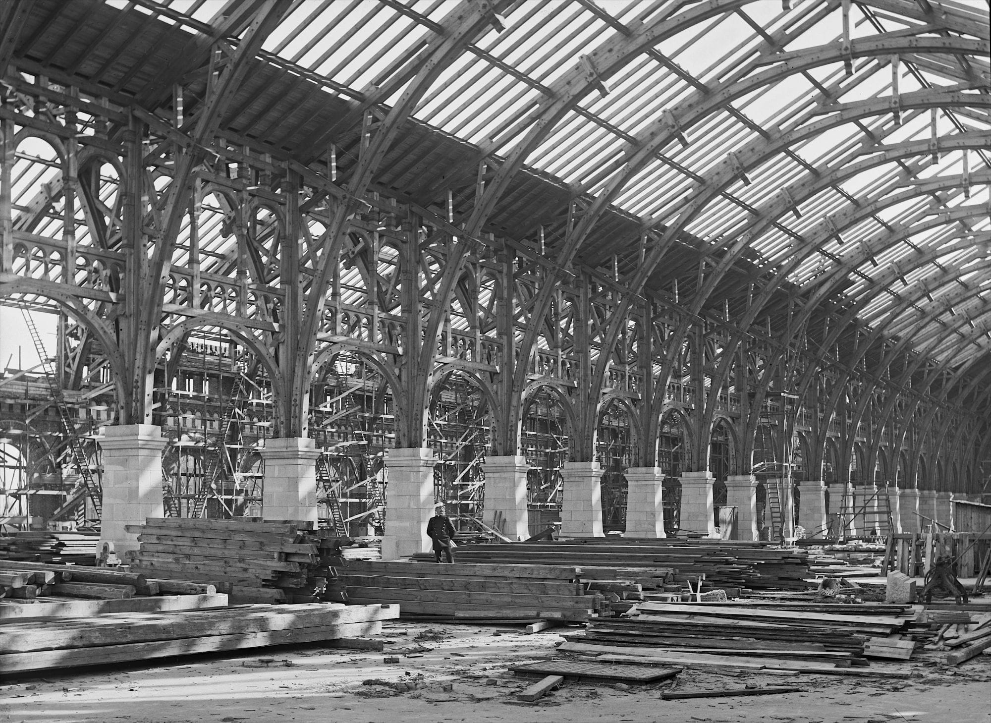
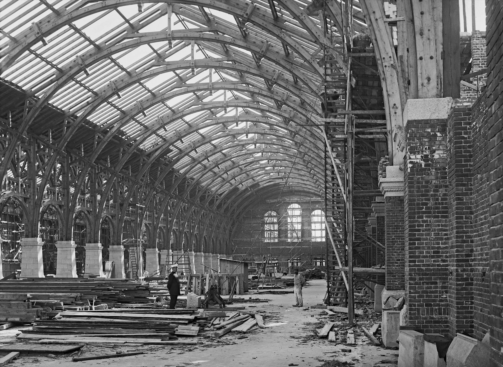
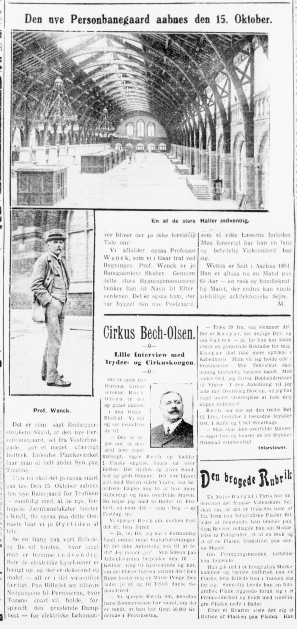
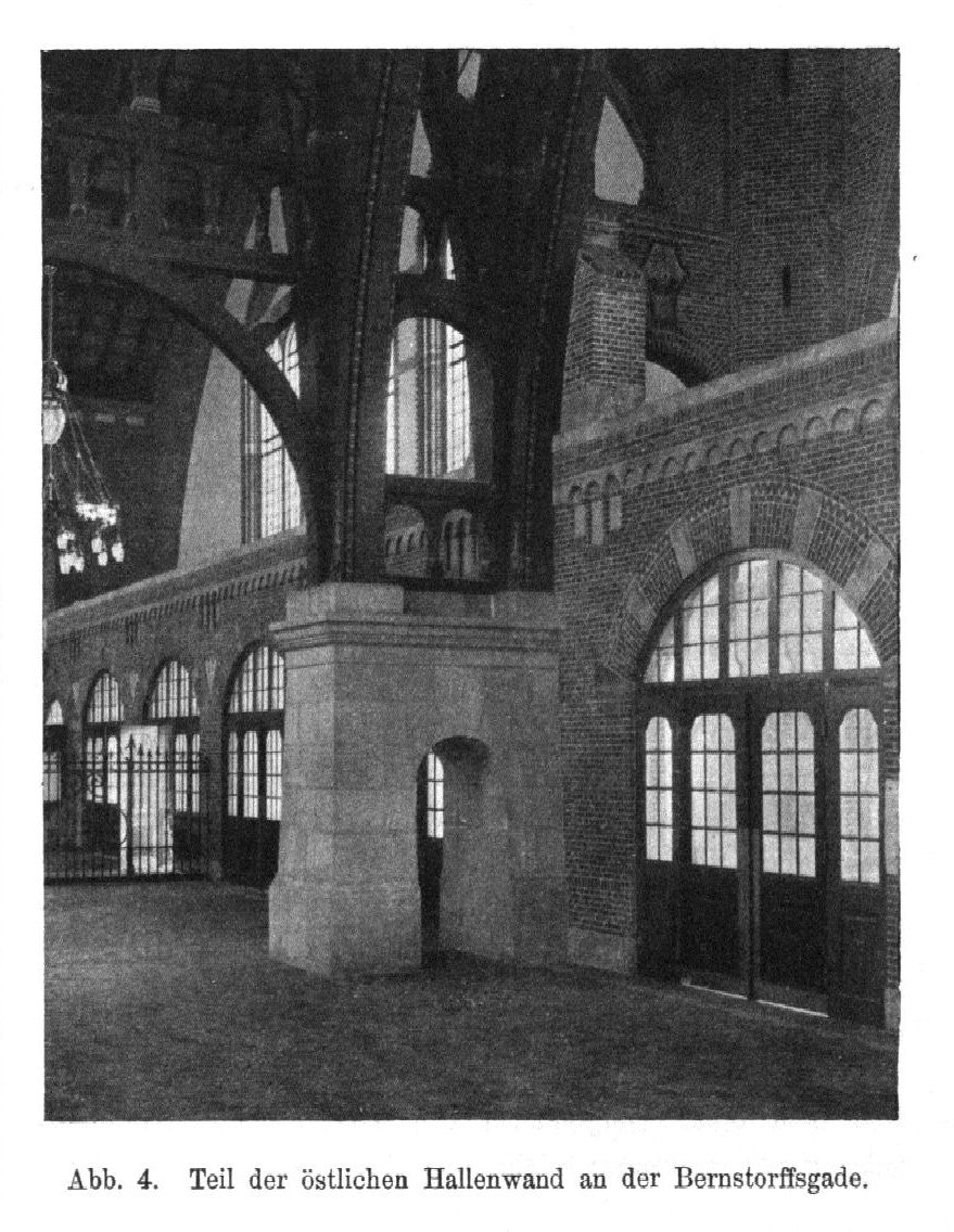
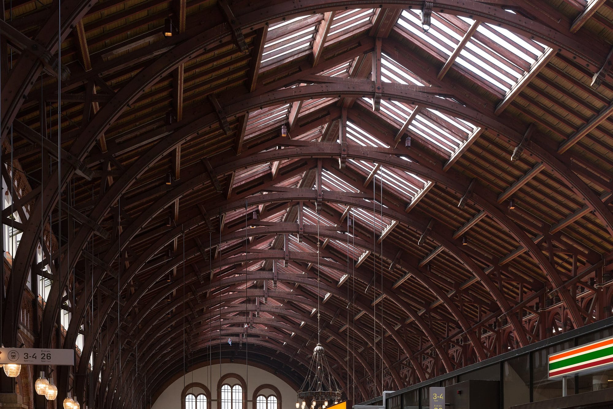
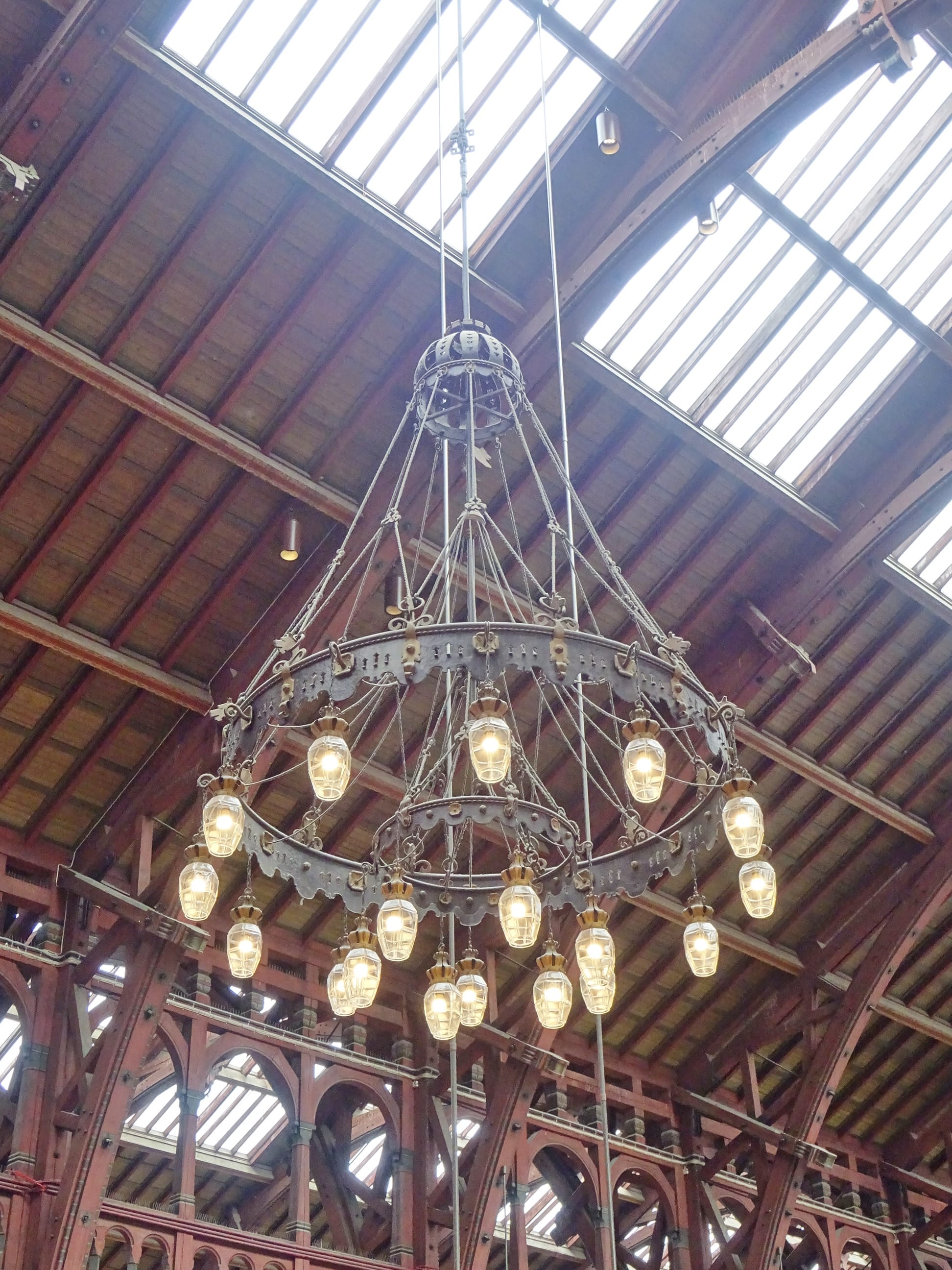
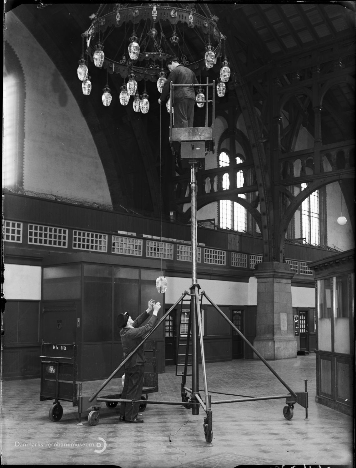
Cross section of the entryway, departures and arrivals halls, with stairs down to the platform, Det Kgl. Bibliotek | Two 1909 construction photos, Ernst Nyrop Larsen, the Museum of Copenhagen | 1911 article on the new station and the architect behind it (that's Wenck) | in Zeitschrift für Bauwesen, 1913 | the wooden arches of the ceiling, 2018, Wikimedia Commons | Chandelier, 2022, Leif Jørgensen, Wikimedia Commons | the hydraulic 'beanstalk' used to clean or repair the chandeliers, 1953, Danmarks Jernbanemuseum
Listed by the Danish Conservation Agency in 1983, Copenhagen Central Station is the second-busiest train station in Denmark today (after Nørreport). The type of traveler passing through continues to expand–after more than a century serving international, intercity, and suburban passengers, in 2019 the København H metro stop opened, connecting the station to Copenhagen’s metro system.
Production Files
Further reading:
- Listing by the Danish Conservation Agency
- Incredibly comprehensive post on the always excellent Dansk Jernbanehistorisk Arkiv
- In Gads Danske Magasin, 1910
- Great article in Siden Saxo, 'Da København fik sin hovedbanegård nummer tre'
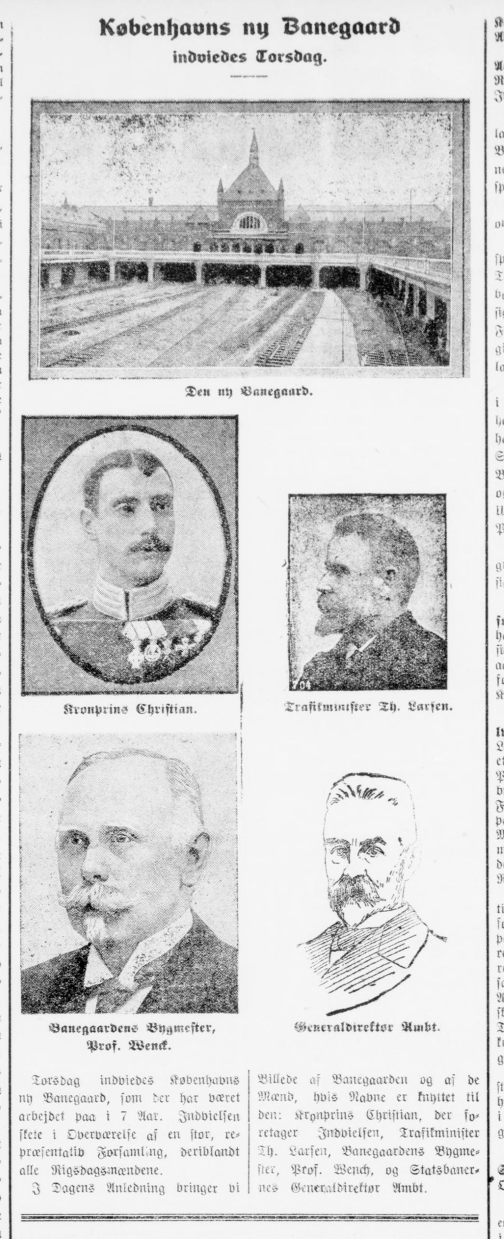
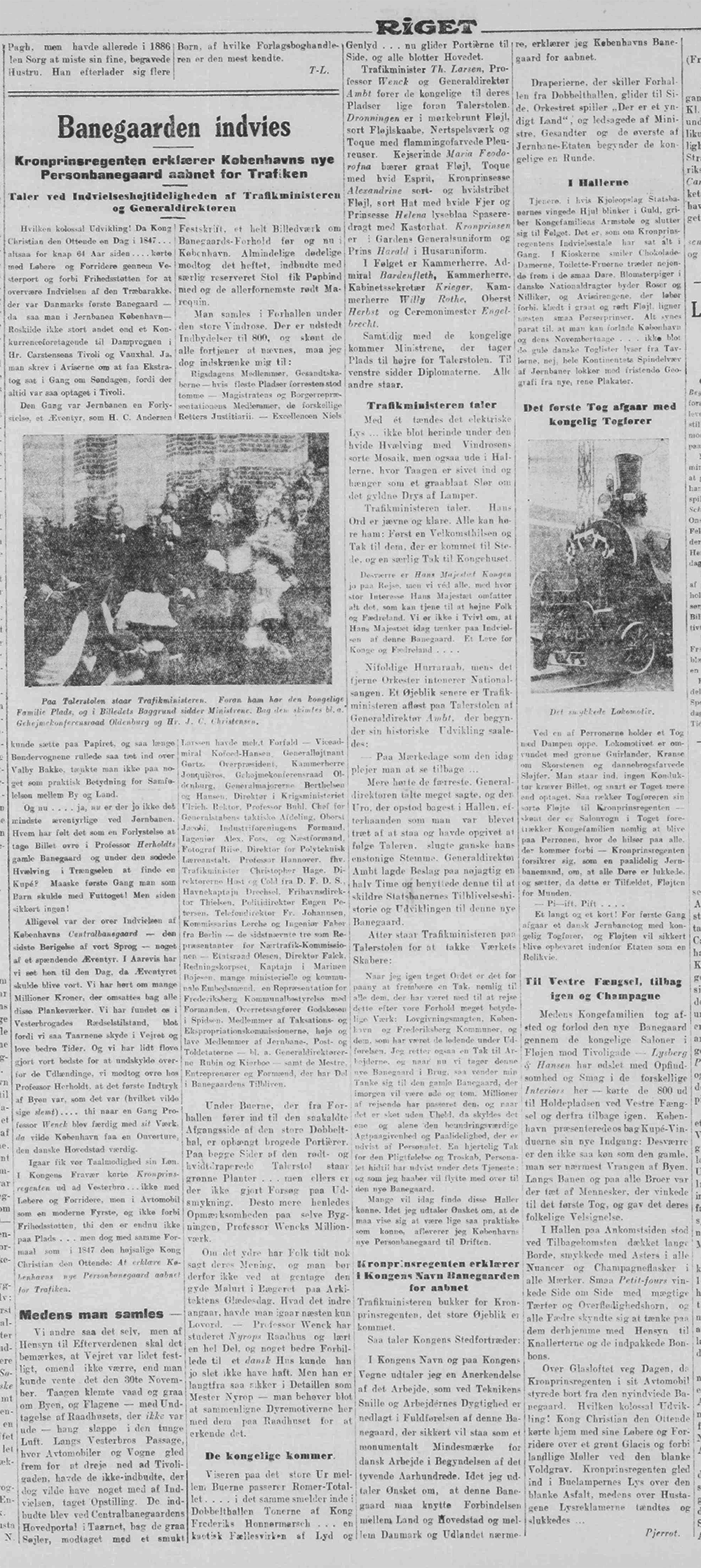
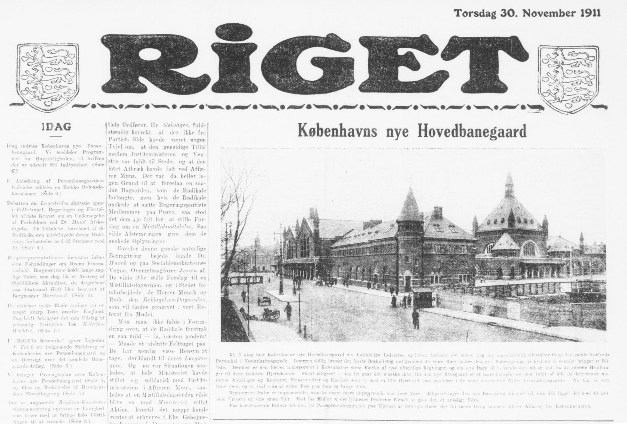
Newspaper articles from the completion and opening of the new station in 1911
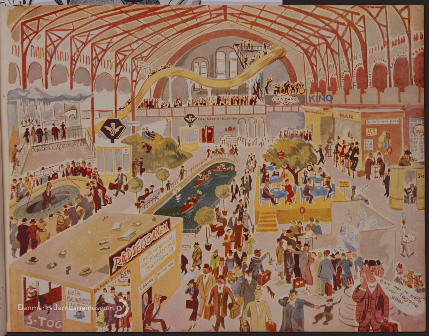
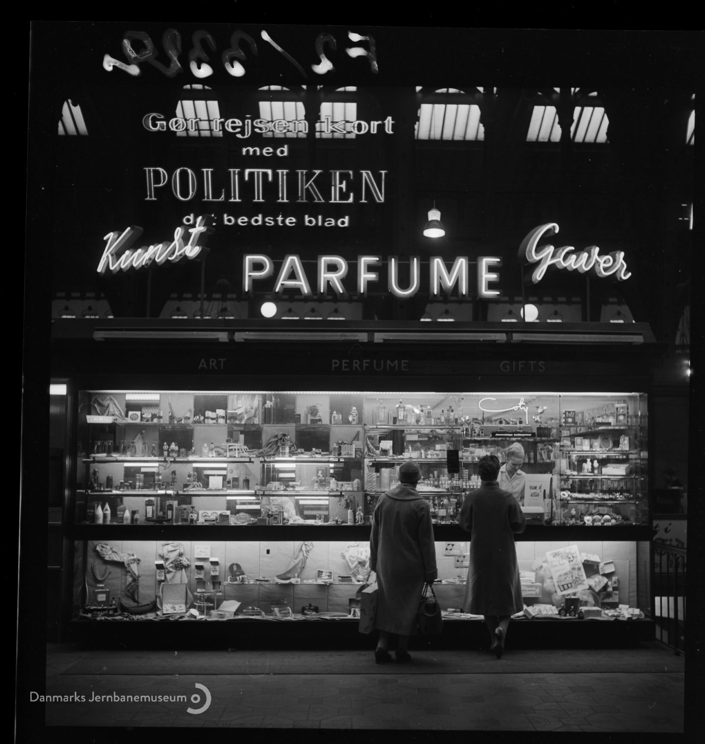
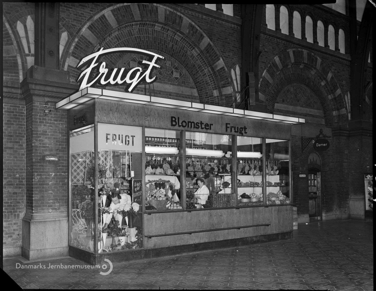
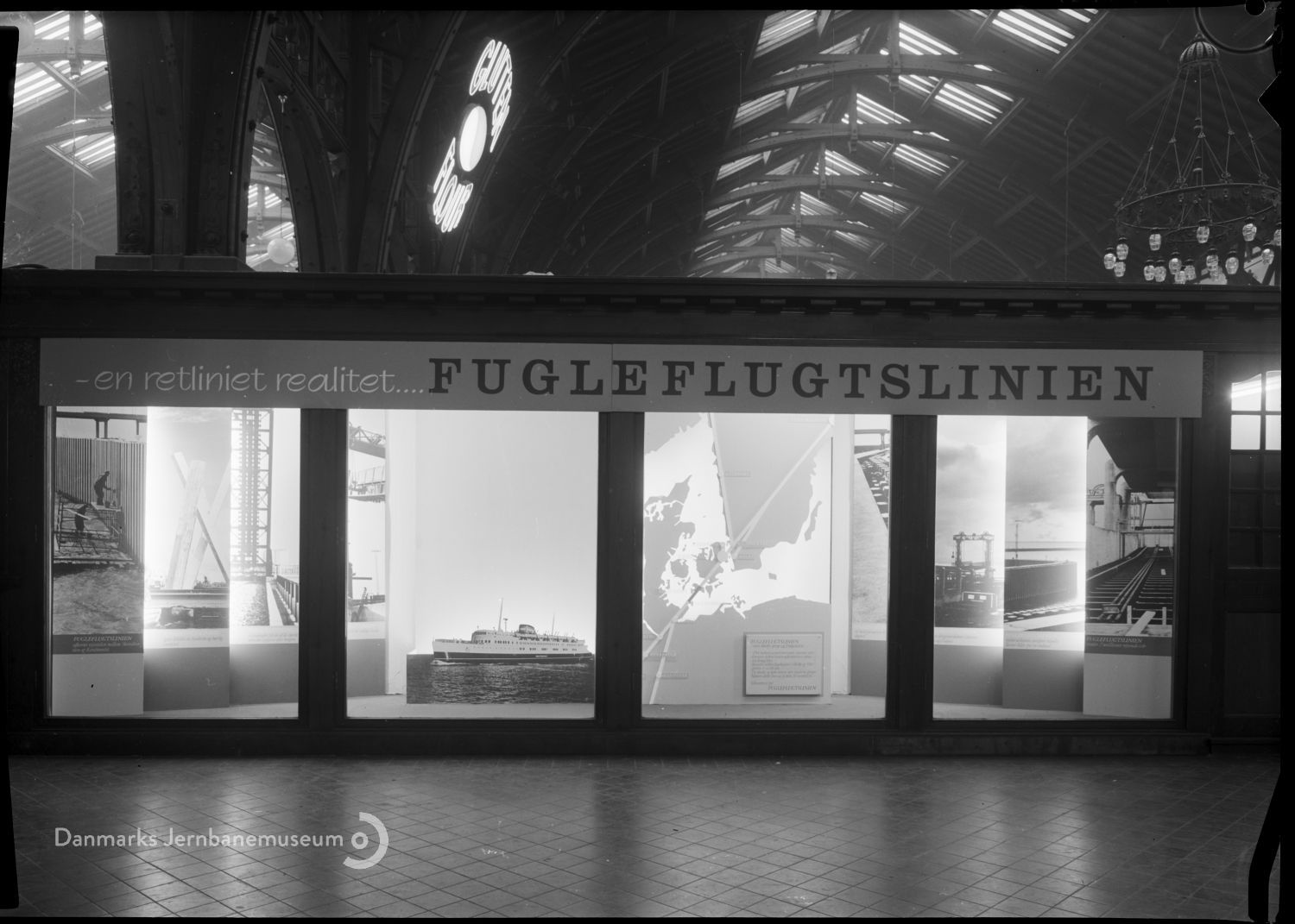
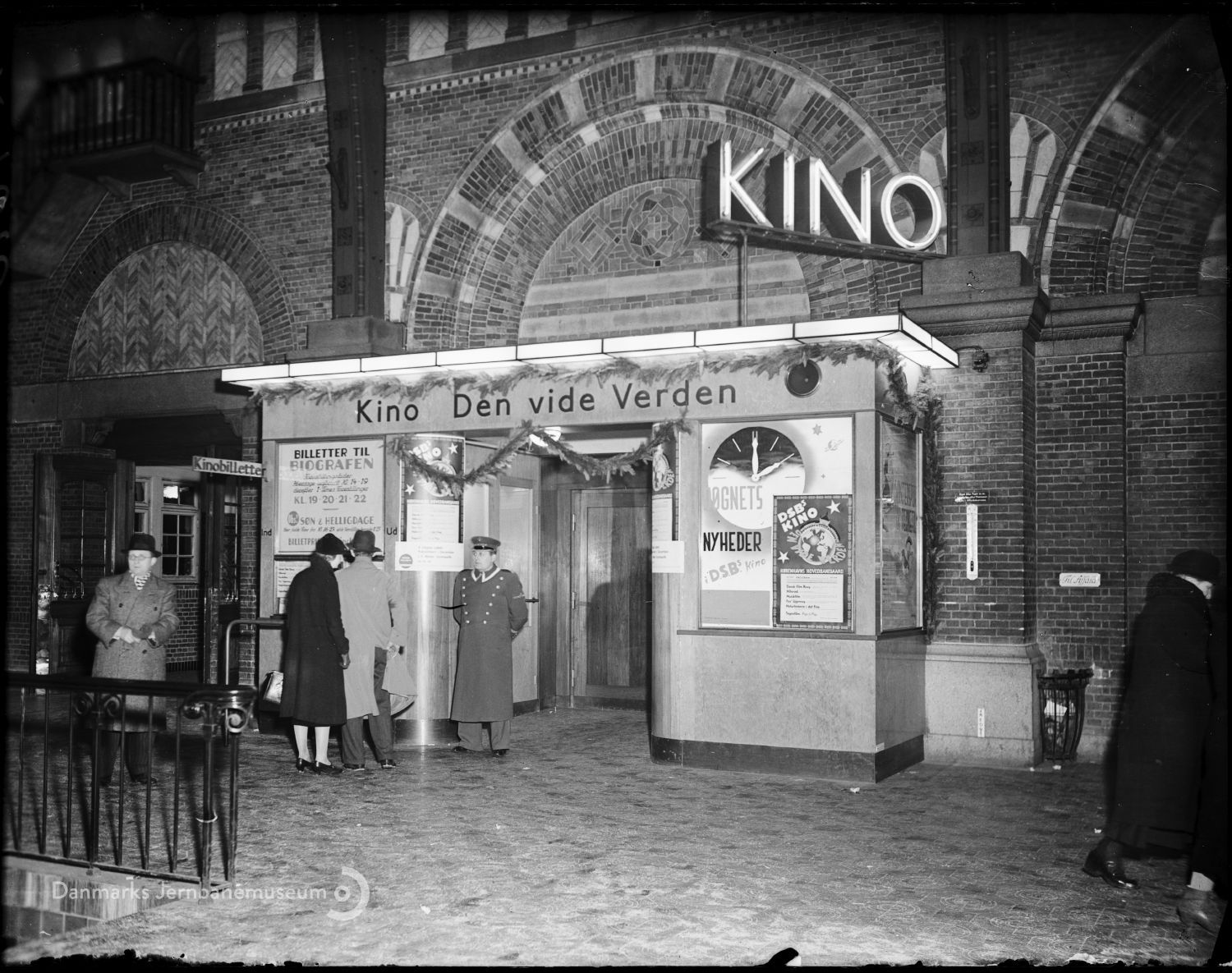
Satirical 1935 cartoon criticizing the changes to the station, which were "too commercial", Danmarks Jernbanemuseum | 1960 photo of a gift shop, Danmarks Jernbanemuseum | 1952 photo of a fruit stand, Danmarks Jernbanemuseum | 1963 advertising kiosk for a cruise line, Danmarks Jernbanemuseum | 1937 photo of the Kino cinema in the station, Danmarks Jernbanemuseum
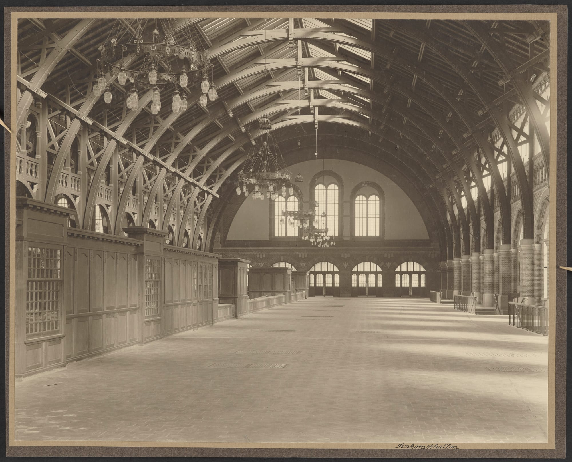
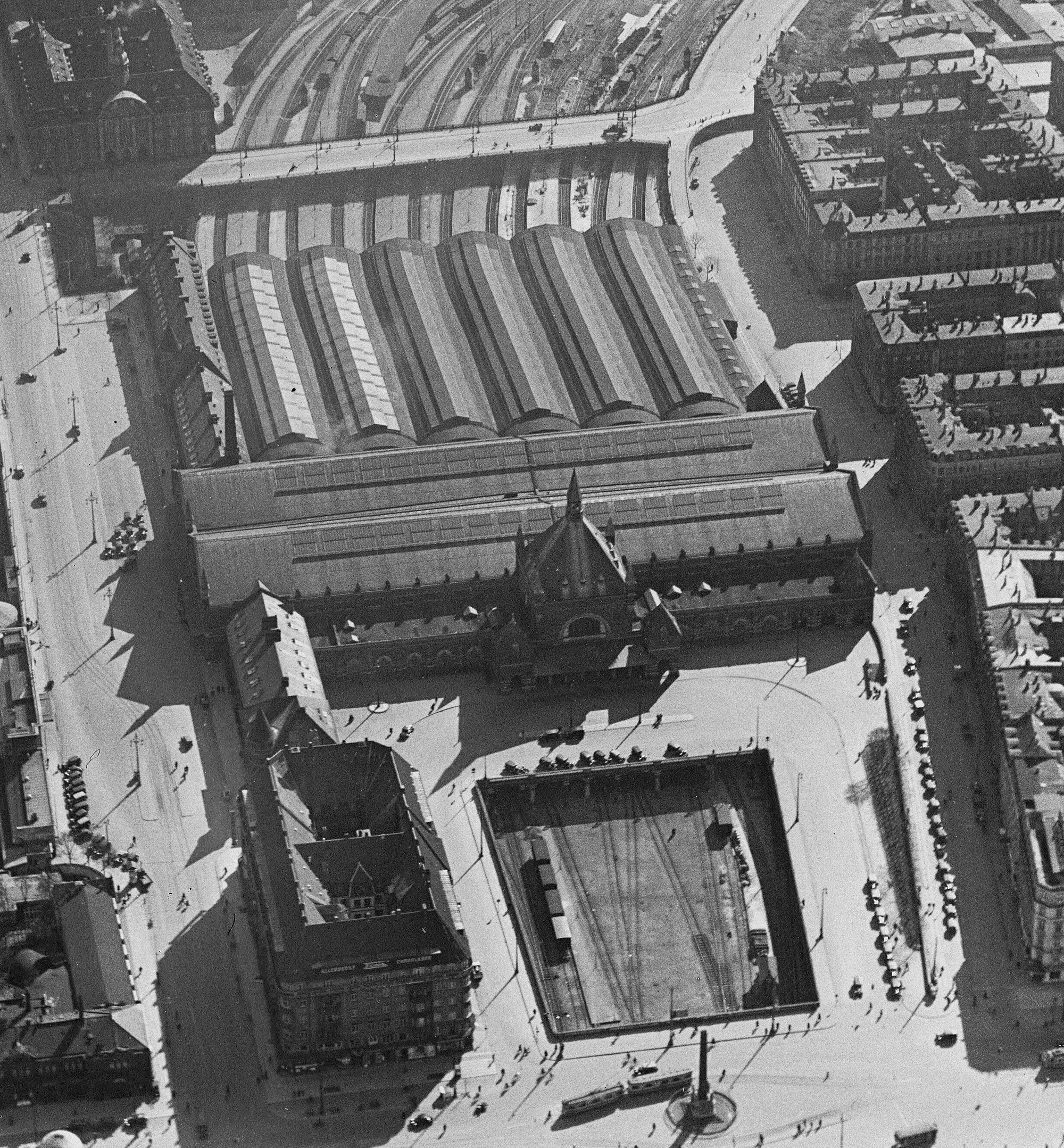
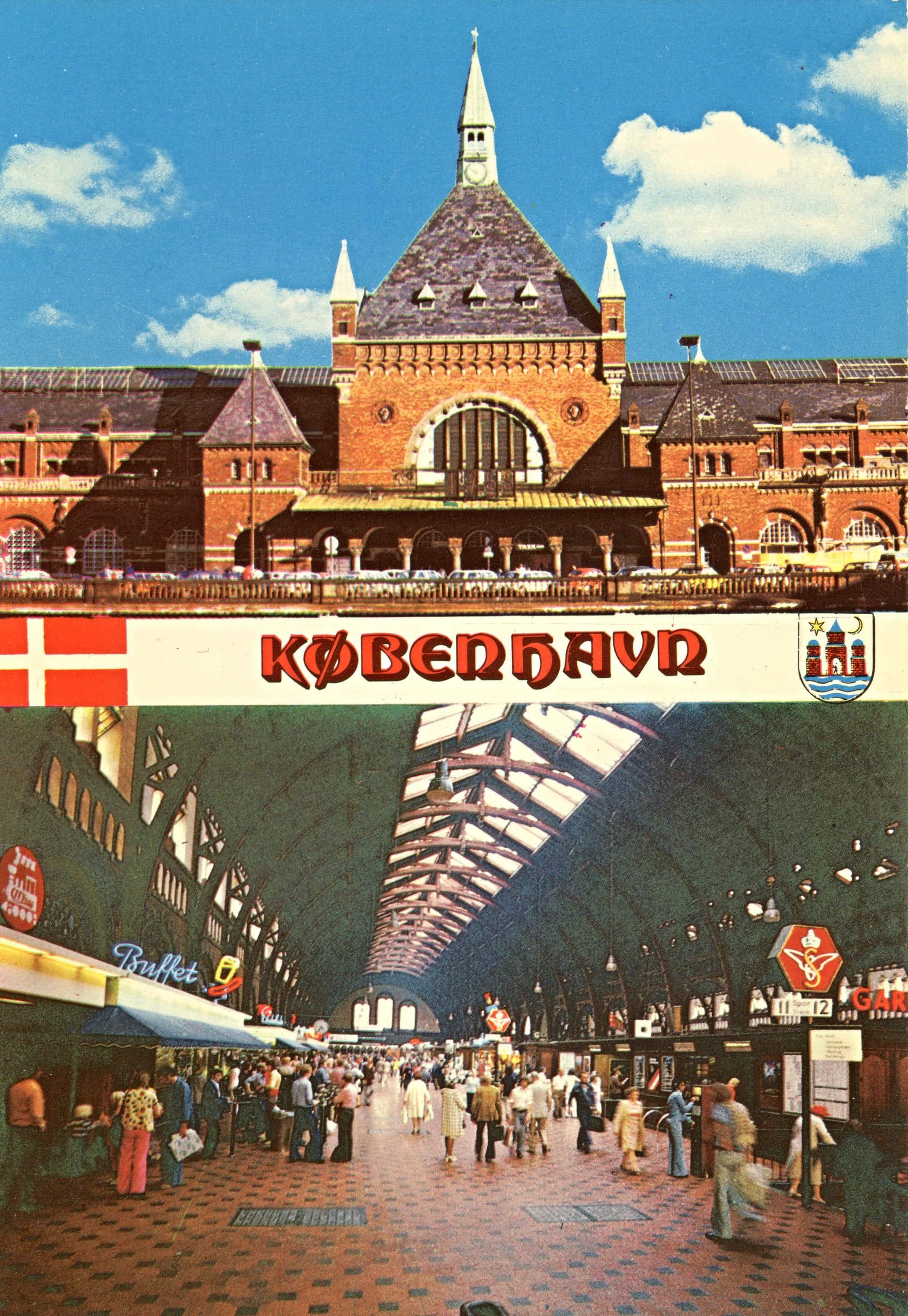
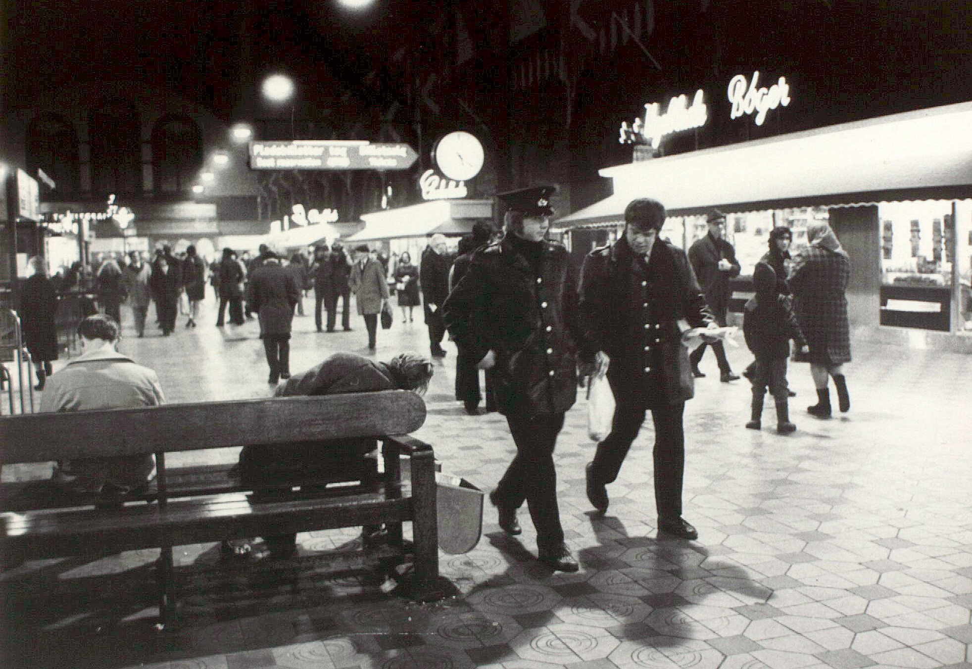
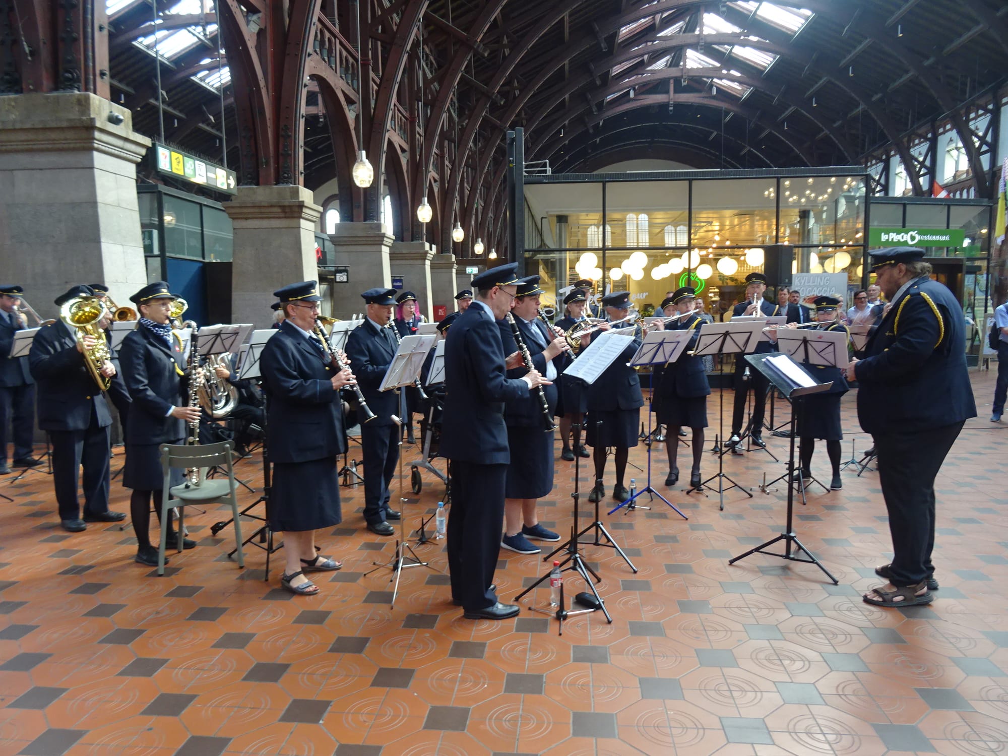
Arrivals Hall, Det Kgl. Bibliotek | 1932 aerial, Danmark set fra Luften | 1960s postcard | 1960s photo with man sleeping on bench, Det Kgl. Bibliotek | concert celebrating 175 years of DSB, 2022, Leif Jørgensen, Wikimedia Commons
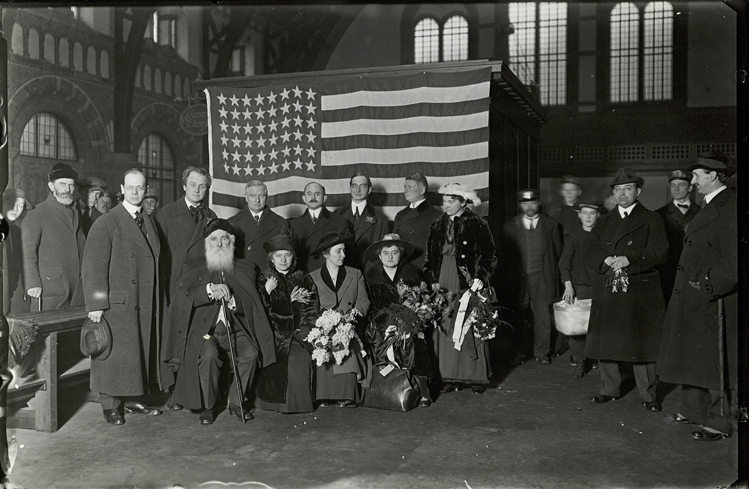
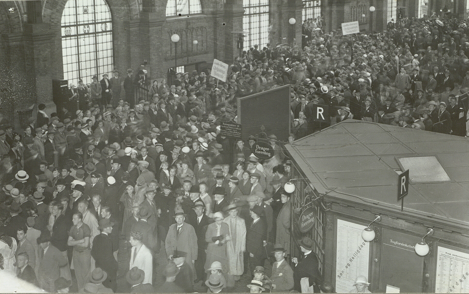
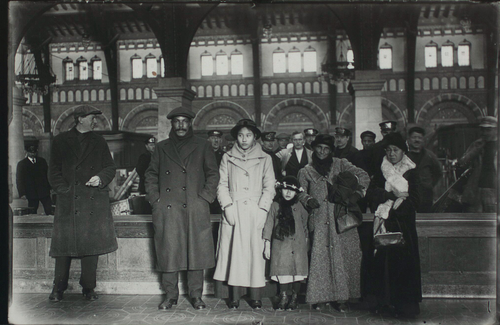
Henry Ford passing through Copenhagen Central Station in 1915 as part of his weird little amateur peace expedition, Holger Damgaard, Det Kgl. Bibliotek | the station full of protestors as part of the Bondetoget til Amalienborg, July 29, 1935, a protest action by the fascist-adjacent Landbrugernes Sammenslutning demanding more support for farmers and their traditional way of life, Det Kgl. Bibliotek

Member discussion: